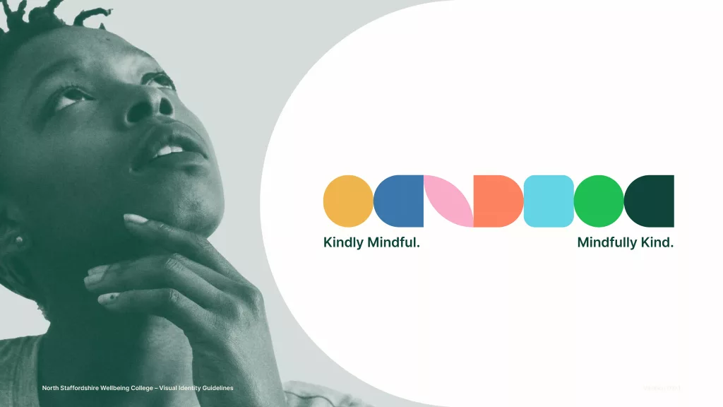
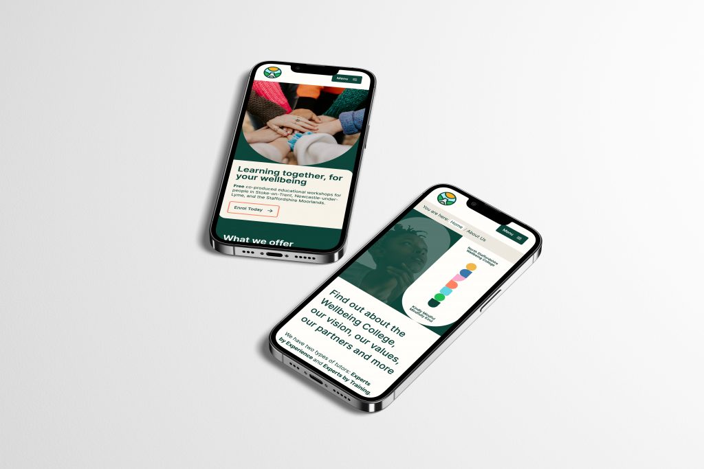
The Wellbeing College of North Staffordshire required a website, I proposed a review and development of their visual presentation to align with the stated aims of the organisation.
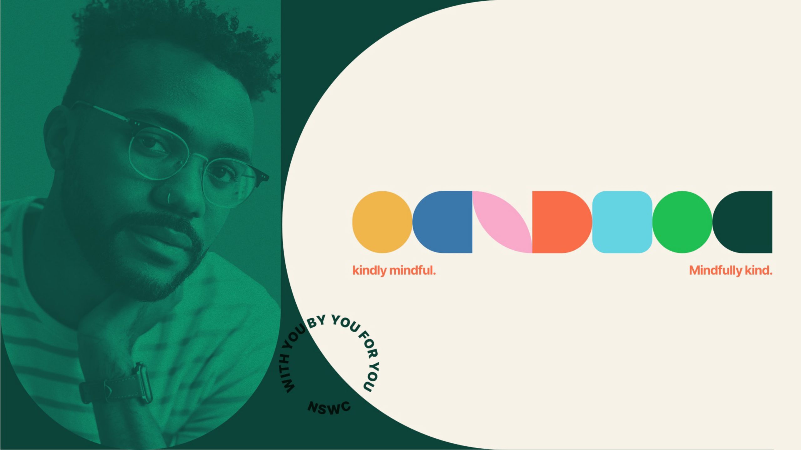
The logo was an evolution of a design that Wellbeing College students had created.
I collaborated with them to develop a more functional and accessible mark, that retained their original use of the iconic Staffordshire hills and kilns.
With my experience in development we opted to design and develop the website simultaneously in the browser using a popular page building software and custom HTML/CSS/JS.
This process to reduced overhead and got the final website into the hands of the College team efficiently; once the design was approved the site was already built and ready to go.
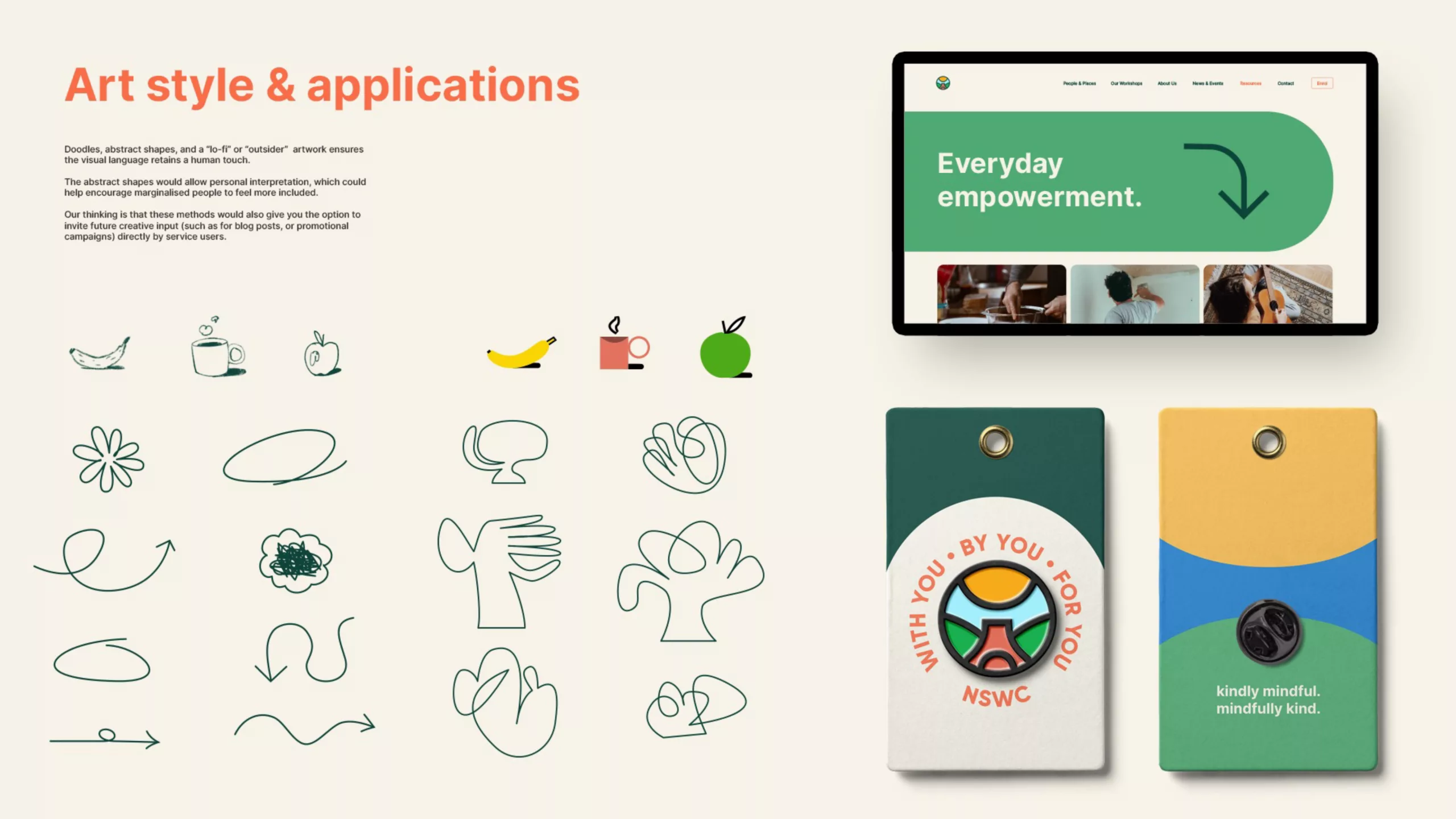
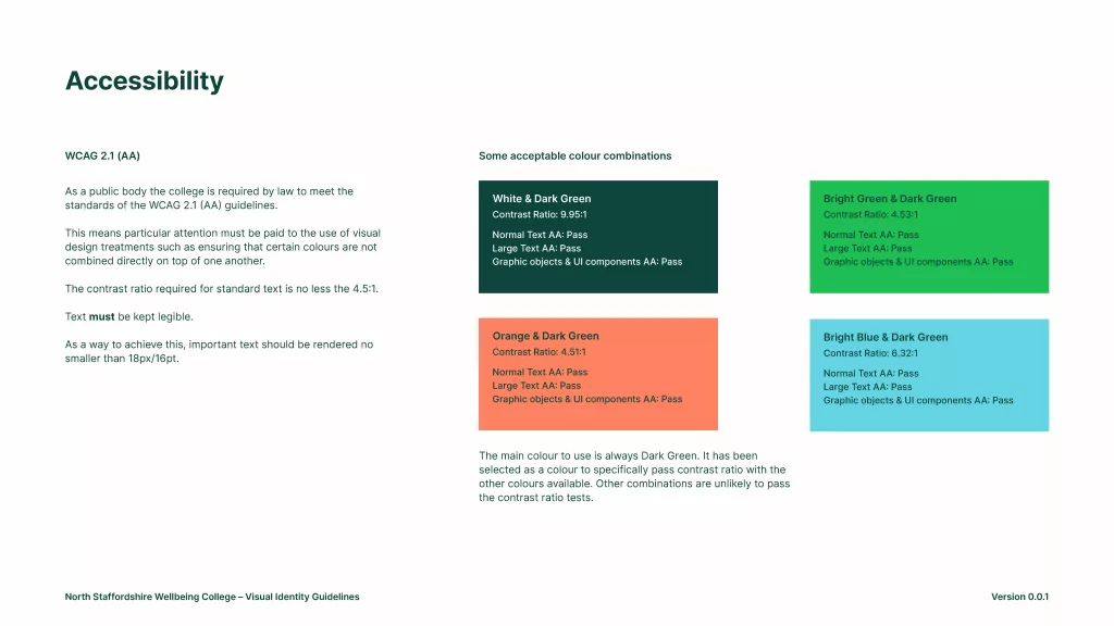
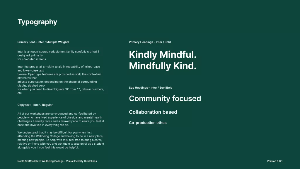
A selection of pages from the presentation document, that offered suggestions for graphic shapes, colours, typography, illustration directions and image treatments.
Typography
With accessibility being a legal requirement, I proposed using larger typesetting and a highly versatile open source font with a tall x-height to aid in readability of mixed-case and lower-case text, landing on the open source family – INTER.
Community Building
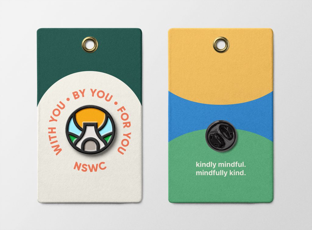
As co-production and community is integral to the college, I proposed producing some pin badges, and other collateral that might help build a sense of belonging for service users who otherwise may feel isolated and left out.